-
- Open a new worksheet in Tableau.
- Go to the Dimensions and drag sub-categories into the rows
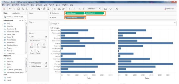
- Sales on to the columns for two times. It will appear as below screen shot.
-
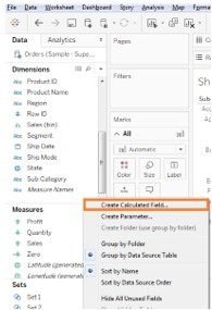
- Create a calculate field by right click on the dimensions area, click on the create calculated field, as shown in below screenshot.
-
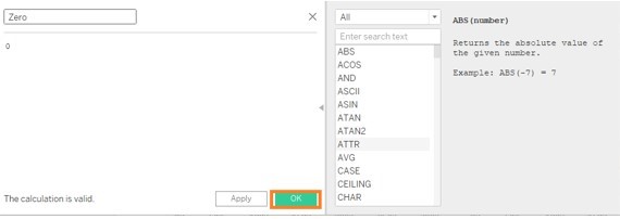
- Name it as Zero and enter value as 0 in the calculated field. We use this Zero calculated field for dual axis and to display the names of the Sub-categories and to synchronize the axis.
-
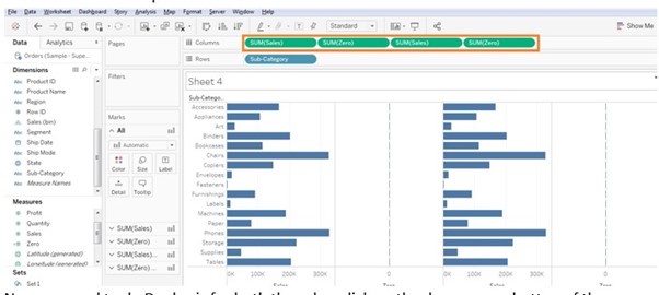
- Drag the Zero calculated field two times as shown in the below screenshot beside the Sales in the columns pane.
-
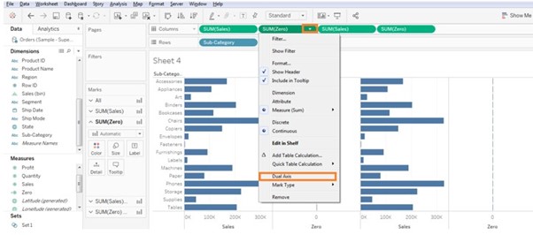
- Now we need to do Dual axis for both the sales, click on the down arrow button of the Zero value on the columns pane and click on the dual axis.
-
- Once we click on dual axis, the chart will turn into the automatic chart as shown in below screenshot.
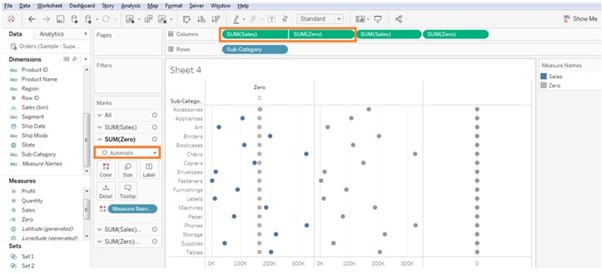
-
- Now in order to make Bar chart, click on the marks card and select to Bar from Automatic.
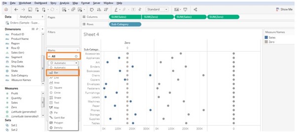
-
- It will appear as below screen shot the automatic chart will be changed to Bar chart.
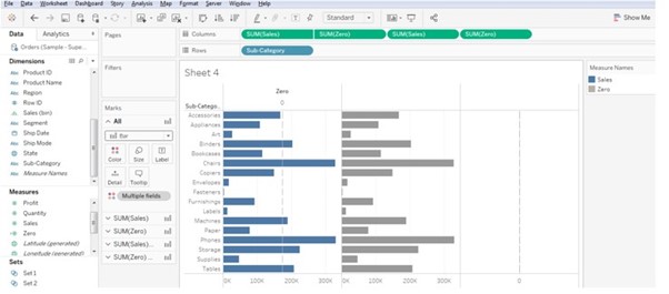
-
- After changing it to the bar chart, change the Zero axis to Text chart and add sub-category into the labels.
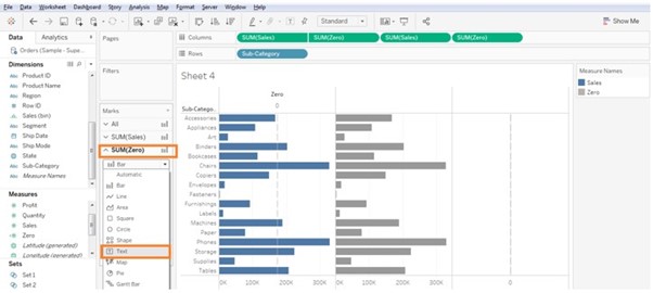
-
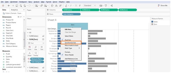
- Right click on the Zero axis and select Synchronize axis.
-
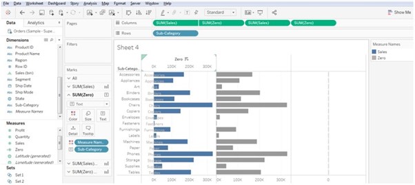
- Then the sales and Zero axis will get synchronize and align to one axis as shown in below screenshot.
-
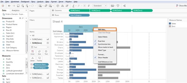
- Right click on the Zero axis and click on Edit axis.
-
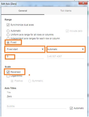
- It will appear the below screen, select the below highlighted options in order to reverse the axis and make the chart to show as butterfly wings.
- Select Fixed.
- Fixed Start as 0
- Automatic
- It will appear the below screen, select the below highlighted options in order to reverse the axis and make the chart to show as butterfly wings.
-
- Chart will change to reverse as shown in below screenshot.
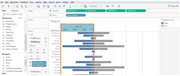
-
- Follow the same steps as mentioned above for the other Zero axis and Sum of sales.
- Make Dual Axis of the sum of sales to another Zero axis
- Follow the same steps as mentioned above for the other Zero axis and Sum of sales.
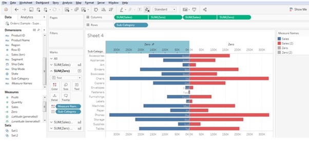
-
- Right click on the Zero axis and click on edit axis and follow the same as we did for the previous axis except reversed as shown in below screenshot.
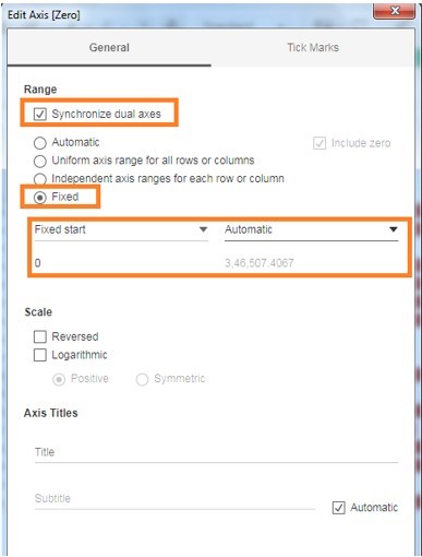
-
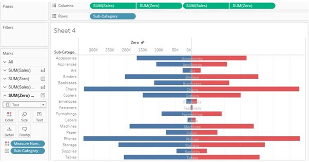
- Go to Marks card and select the second Zero axis and change the chart type from the Bar Chart Type to Text Chart type.
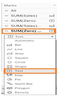
-
- Now the Chart appears as below:
-
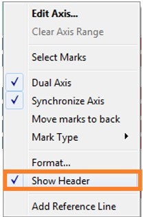
- To make it clearer we can hide the headers on both the axis and we can bold the labels in the Chart to make it visible.
-
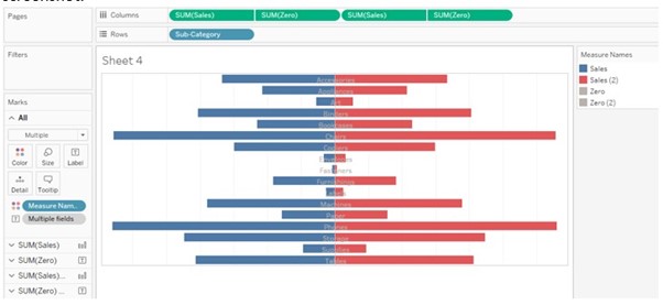
- After hiding the Axis on all the sales and Zero Axis it displays the chart as below screenshot
-
- We can change the view of the chart from the standard view to entire view and bold the labels on the Zero Axis display better.

-
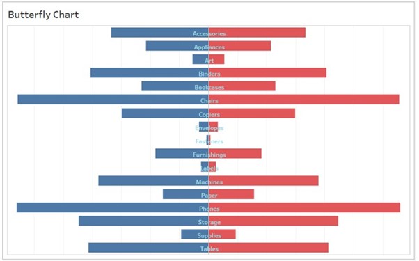
- Chart looks like below screen shot after changing entire view and bold the labels, edit the Title to Butterfly Chart.
