A pie chart represents data as slices of a circle with different sizes and colors. The slices are labelled and the numbers corresponding to each slice is also represented in the chart. You can select the pie chart option from the Marks card to create a pie chart. By using pie charts to show proportions of a whole.
Steps to create a PIE chart:-
The basic building blocks for a pie chart are as follows:
| Mark type: | Pie |
| Color: | Dimension |
| Angle: | Measure |
Step1:- Connect to the data source.
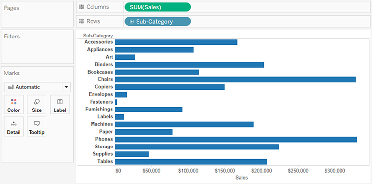
Step2:- Drag the Sales measure to Columns.
Step3:- Drag the Sub-Category dimension to Rows.
The default chart type is a bar chart as shown below.

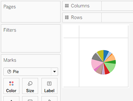
Step4:- Click Show Me on the toolbar, then select the pie chart type.
The result is a rather small pie:

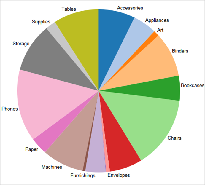
Step5:- To make the chart bigger, hold down Ctrl (hold down) & press up-arrow several times.
Step6:- To add labels, drag the Sub-Category dimension from the Data pane to Label on the Marks card.


